ShopDreamUp AI ArtDreamUp
Deviation Actions


Description
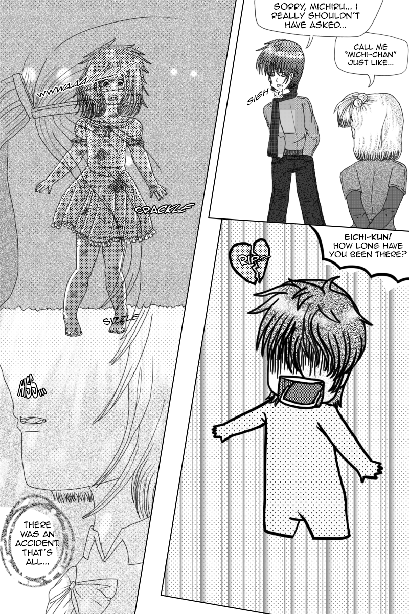
:Edit 3: I did major work on this page again.
Edit 2: I just tried further exaggerating panel 1 Michi's proportions and anatomy to make her look younger.
Edit: Thanks to some wonderful critique, I've attempted to fix some of the anatomy of this picture. I hope this looks better now.
Poor Eichi and clueless Michiru.
This page took a lot and I mean a lot of work.
Mahou Sakura Sekai (C) Katidid1992
Image size
800x1200px 1.13 MB
Comments9
Join the community to add your comment. Already a deviant? Log In
Amy: This is my first critique, so sorry if it's not very helpful. The panel layout and the use of tones is excellent. Michiru's arms look a little big around in the first panel though (like a sailor's arms), and her hands look a little too small, although they wouldn't look as bad if her arms were a little bit smaller. Remember, a girl's arms should be slender. Her shoulders also look a little bit square in the first panel. I get that she's supposed to be tense, but her shoulders still should not travel across a straight line.
Akira also looks a little bit awkward in the third panel, as if he doesn't have arms. Eichi looks hilarious in the last panel (as chibis should), but again, it looks as if he has no arms. But maybe that was on purpose.
If you really want to publish this as a manga someday, I'd advise that you flip the panels to flow right-to-left. Even American manga flows in this direction. I understand that, being an English speaker, you draw left-to-right by instinct, but whatever program you used probably has an option such as "flip canvas horizontally", which would make changing the flow easier. However, if you did that, you would have to redo the text, since it would all end up backwards.
Overall, I like it, but I can't wait to see how you improve as time goes on.